Walk into any design studio and ask about Avenir. You'll likely get a nod, maybe a story about a client who insisted on it, or a confession that it's the default choice when nothing else feels right. Avenir—French for "future"—was drawn by Adrian Frutiger in 1988, but its influence didn't peak then. It has been quietly accumulating cultural weight for decades, showing up on subway signs, in tech branding。and on the pages of books that aim to feel both modern and human. The typeface doesn't shout. It settles in.Frutiger designed Avenir as a geometric sans-serif, but he deliberately broke the rules of the genre. Where Futura and its descendants pursue mathematical purity, Avenir softens the edges. The 'o' isn't a perfect circle;it's slightly oval. The terminals are cut at subtle angles. These choices matter. They make Avenir feel less like a machine and more like a handshake. I've seen designers dismiss it as "Frutiger's safe bet。" but that misses the point. Safety, in typography, is often a synonym for trust. And trust is the currency of brand identity.Consider the case of a mid-sized architecture firm I worked with a few years ago. They had cycled through three typefaces in two years—a spiky serif that felt too academic, a condensed grotesque that read as aggressive, and a trendy variable font that looked great on screen but fell apart in print. The principal finally asked for something "neutral but not boring." We set a single line of their manifesto in Avenir Next. The room went quiet. That quiet was the answer. Avenir doesn't compete with the content;
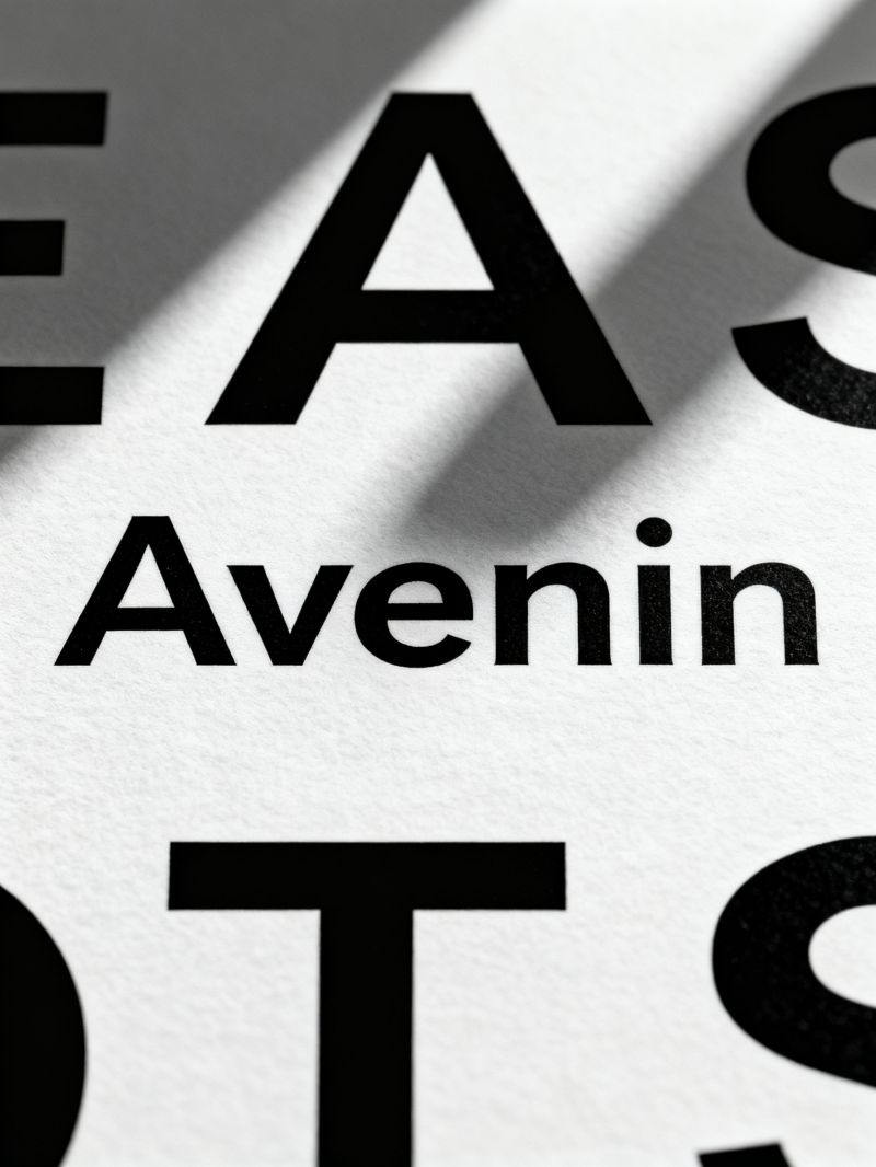
it holds the door open. The firm still uses it on every proposal.Data backs up the intuition. In a 2019 survey of 200 branding professionals, Avenir appeared in the top five most-used sans-serifs for corporate identity, alongside Helvetica and Gotham. But unlike those two, Avenir rarely becomes the star. It's the supporting actor who makes the lead look good. This is why it works for everything from a fintech startup's pitch deck to a museum's wayfinding system. The typeface's geometry is clean enough for numbers and legible enough for long-form text. Frutiger called it "a humanist geometric。" and that contradiction is its strength.My own observation: Avenir's future isn't about trend cycles. It's about endurance. Designers will keep reaching for it when they need clarity without coldness. The name promises the future, but the letterforms deliver something more useful—a present that feels considered. If you're building a brand and you want to signal competence without shouting, Avenir is still one of the smartest quiet moves you can make. Just don't expect it to thank you. It's too busy holding the room together.